Redesigning a babysitter Website for better conversion
Overview
Redesigning sitly a babysitter and child minder platform.
Roles
- Lead designer
- Interaction designer
- Visual designer
- Prototype
- Project manager
- Design system
Introduction
“Sitly is a platform built to help parent’s find capable help and care We want your kids to have the best care. It is the fastest growing platform where babysitters, nannies, and families can connect with each other.
Problems
Sitly’s current design is not in line with modern desig, while it is still the best compared to other competitors in europe a lot of it’s UI can be developed. Let us list some of the problems.
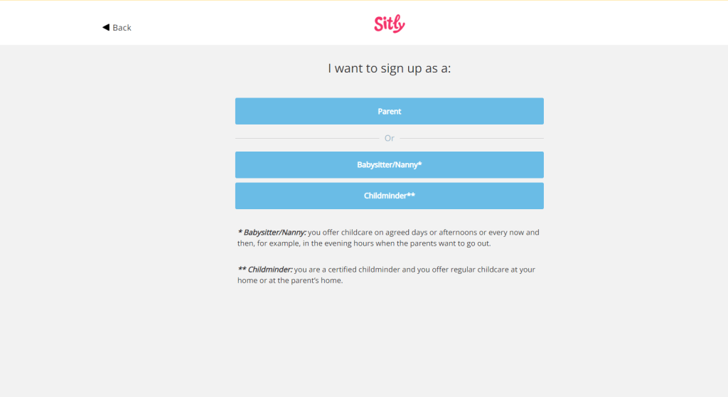
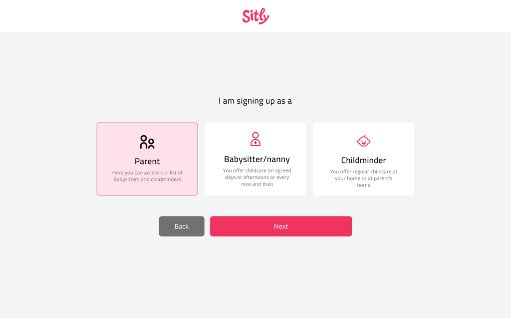
- Too many call to action buttons on the plaform especially the homepage, not very clear on what options to go with.
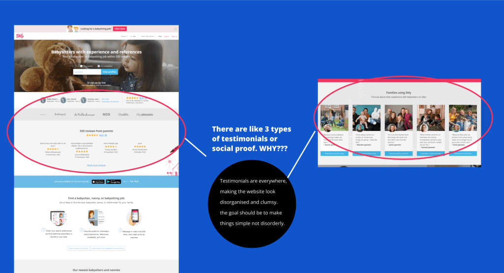
- The reviews and testimonials on the home page appear far too many times and should not be the main selling point of the platform.
- The website fails to explain how to use or navigate the platform
- The find a babysitter page can be optimised design wise so users can get maximum conversion when they search the platform for babysitters or babysitter jobs.
Solutions
Through this design we hope to increase usability, user retention and the User experience of the users of this platform.
Make the search result better and interactive.
The Goal
Design Process or Thinking Process
Understand
Understand the problem and gather up requirement
UX research
Check other Babysitter platforms, look at their painpoints and selling points.
Design
Information architecture,sketch flows, visual designs, prototype
Test prototype
Test to see how the platform interacts and navigates.
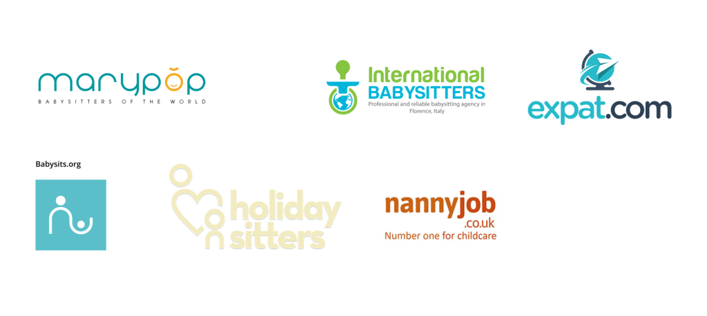
Benchmark analysis
I tested and navigated the following websites and tried to see which of them had a unique selling point, The aim was to compare their existing performance against others and adopt improvements that fit their overall approach to continuous improvement and culture of the sitly website.
Solving the problems.
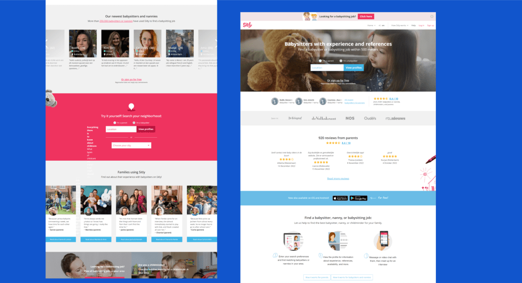
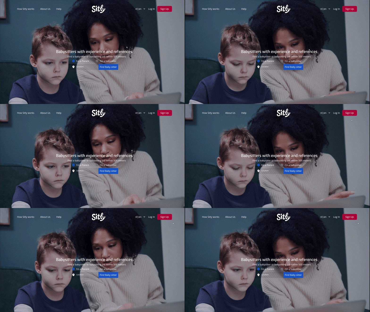
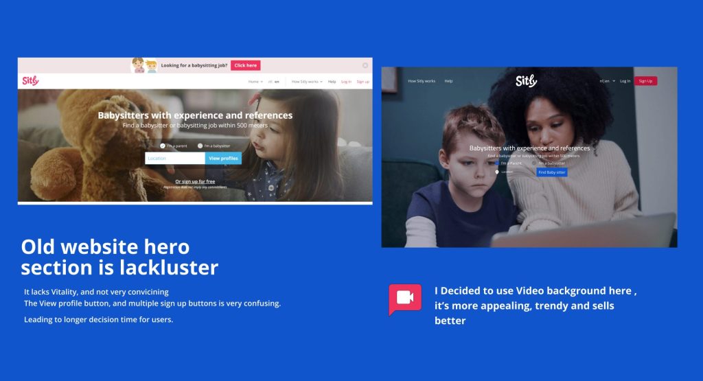
Above the fold matters. The goal of every good platform is to sell the brand in a 3 seconds. The old sitly website had a lackluster hero section and a static picture that showed a child. I decided to go with a more captivating approach.
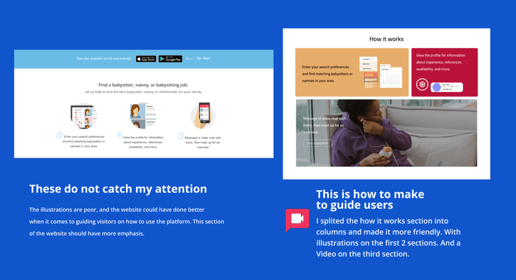
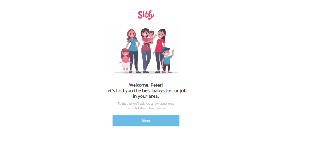
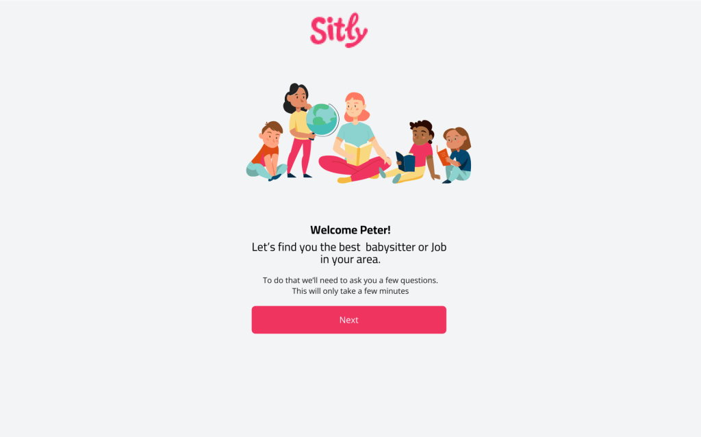
The illustration is not bad, but it can be improved. The aim is to show a babysitter interacting with children and having fun.
Before
After
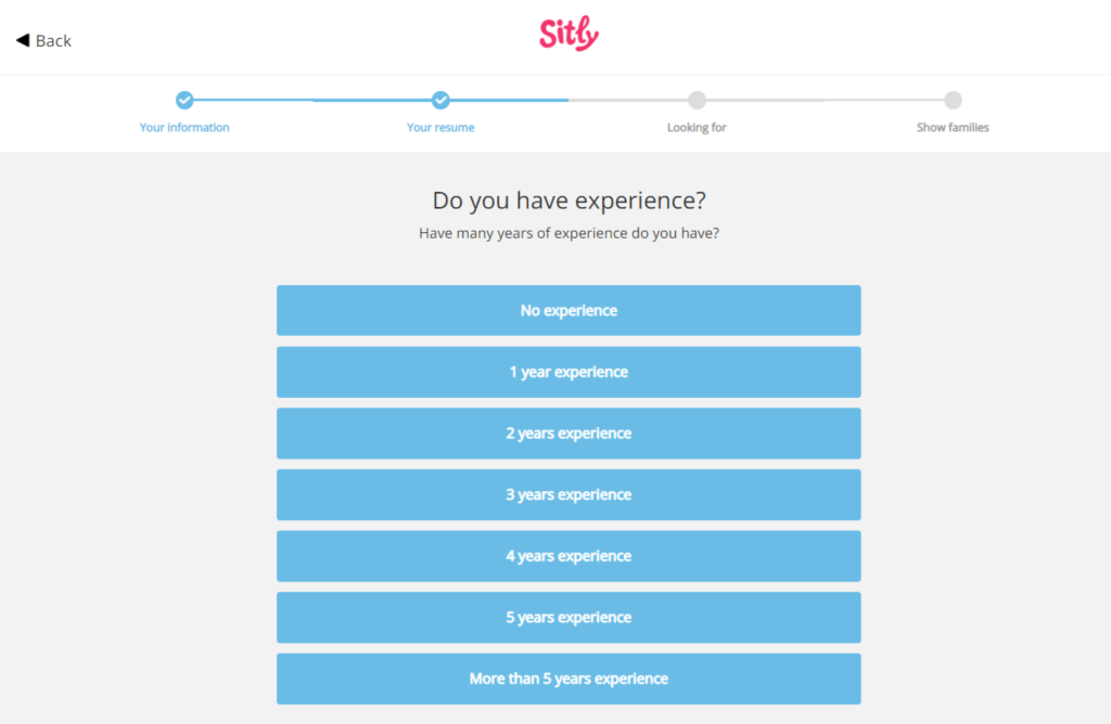
Before
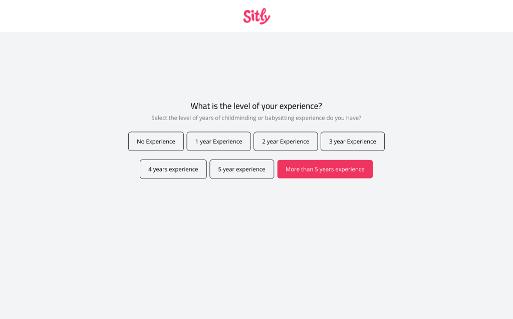
After
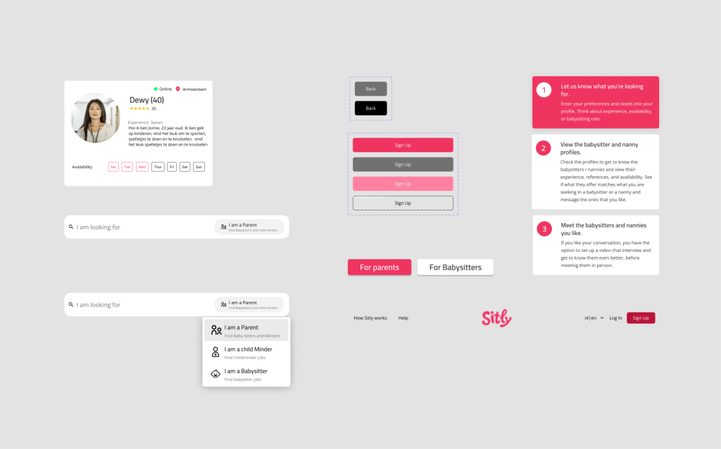
DESIGN SYSTEM
Clickable Prototype
Conclusion
With the user stories developed and a better understanding of the live streaming framework the engineering team used, the design team was tasked in 4 weeks to establish an experience that would be design against the user stories created for the product.