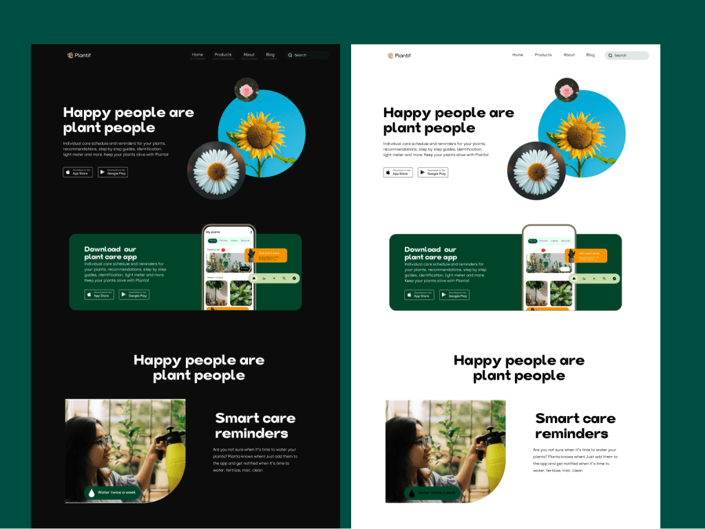
HomePlant website design
Plantify : A resposnive plant store
Table of content
Overview
The case study unveils the story about user experience design for plantify.
Roles
- Lead designer
- Interaction designer
- Visual designer
- Prototype
- Project manager
- Design system
Problems
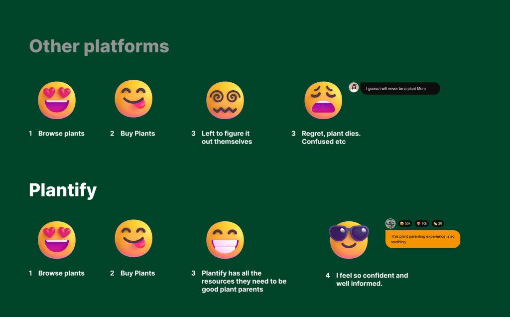
Many people who intend to own plants sometimes do not know where to start from. They are usually faced with the questions of What plants do they want, what plants can they have inside, or get for a friend. what varieties of plants are there. Many users are skeptical about buying the wrong plants, especially the ones the have no idea how to care for.
- Lack of proper information about particular plant.
Solutions
- Create an easy to use platform where plant newbies can find common plants
- Simplify the navigation , shopping experience and customer relations
- Educative resources center should be provided for users to learn the basic information about plant care.
- Providing proper knowledge about plant with plant care and plant scan feature via the mobile app
The Goal
Market research
The first stage of the process was to conduct a market research to understand the strengths and weaknesses of the competitors and see what’s missing in their websites in order to build a better product.I analyzed 3 well known plant stores websites and created the following feature comparison.

Quantitative research

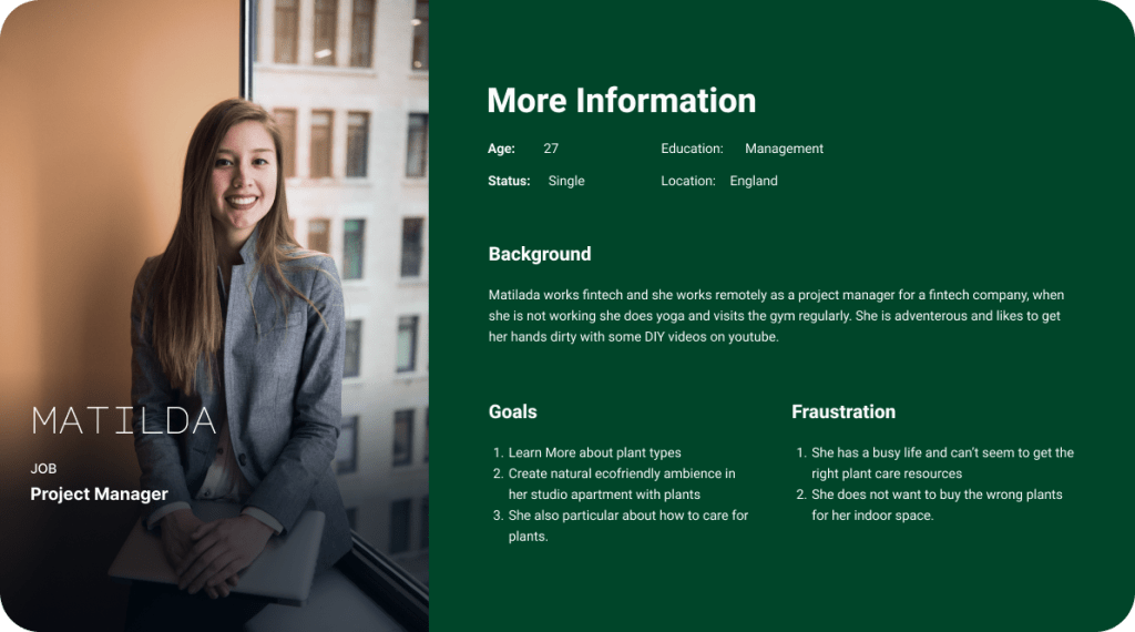
User Personas
Wireframes
With the user stories developed and a better understanding of the live streaming framework the engineering team used, the design team was tasked in 4 weeks to establish an experience that would be design against the user stories created for the product.

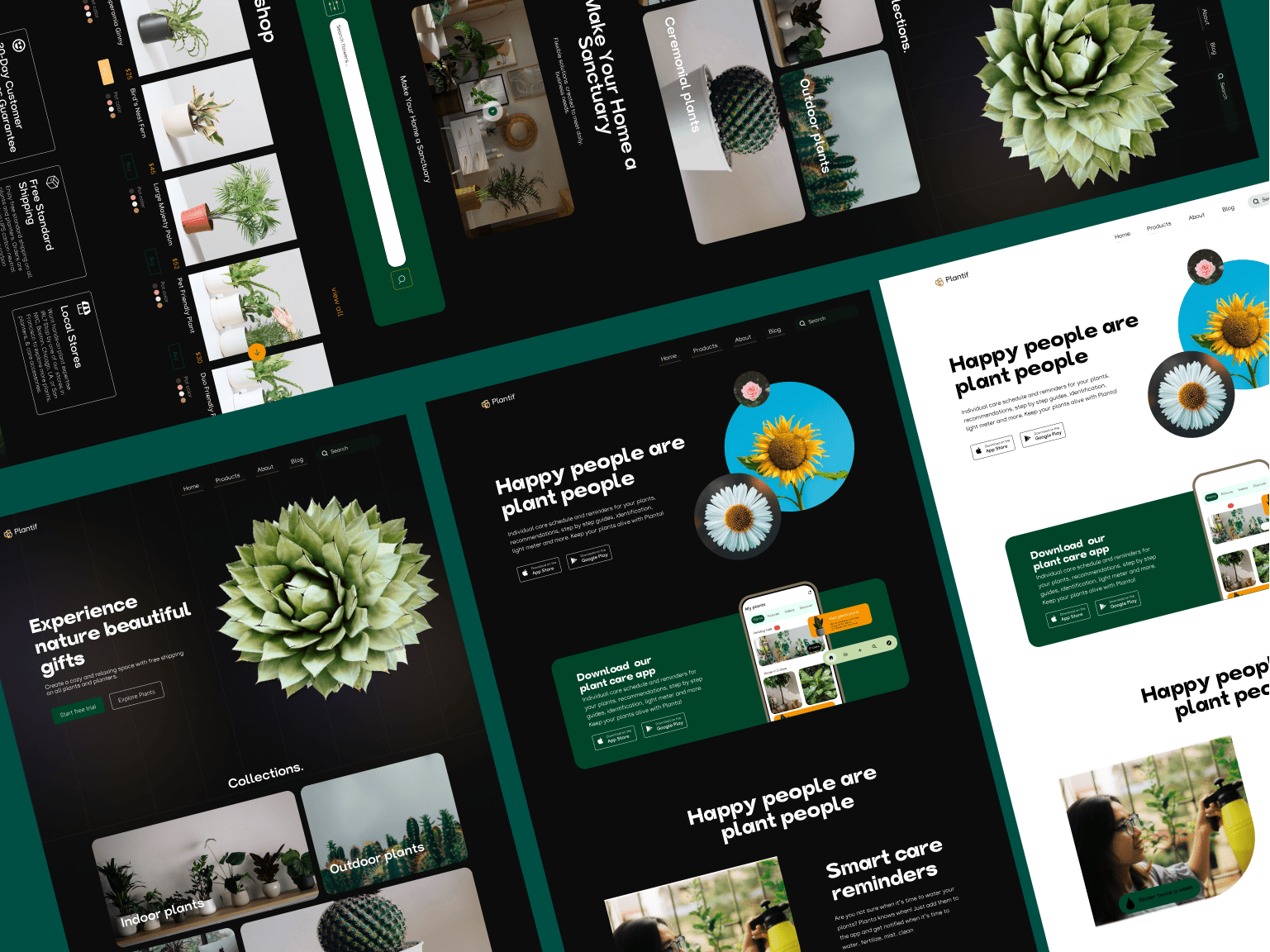
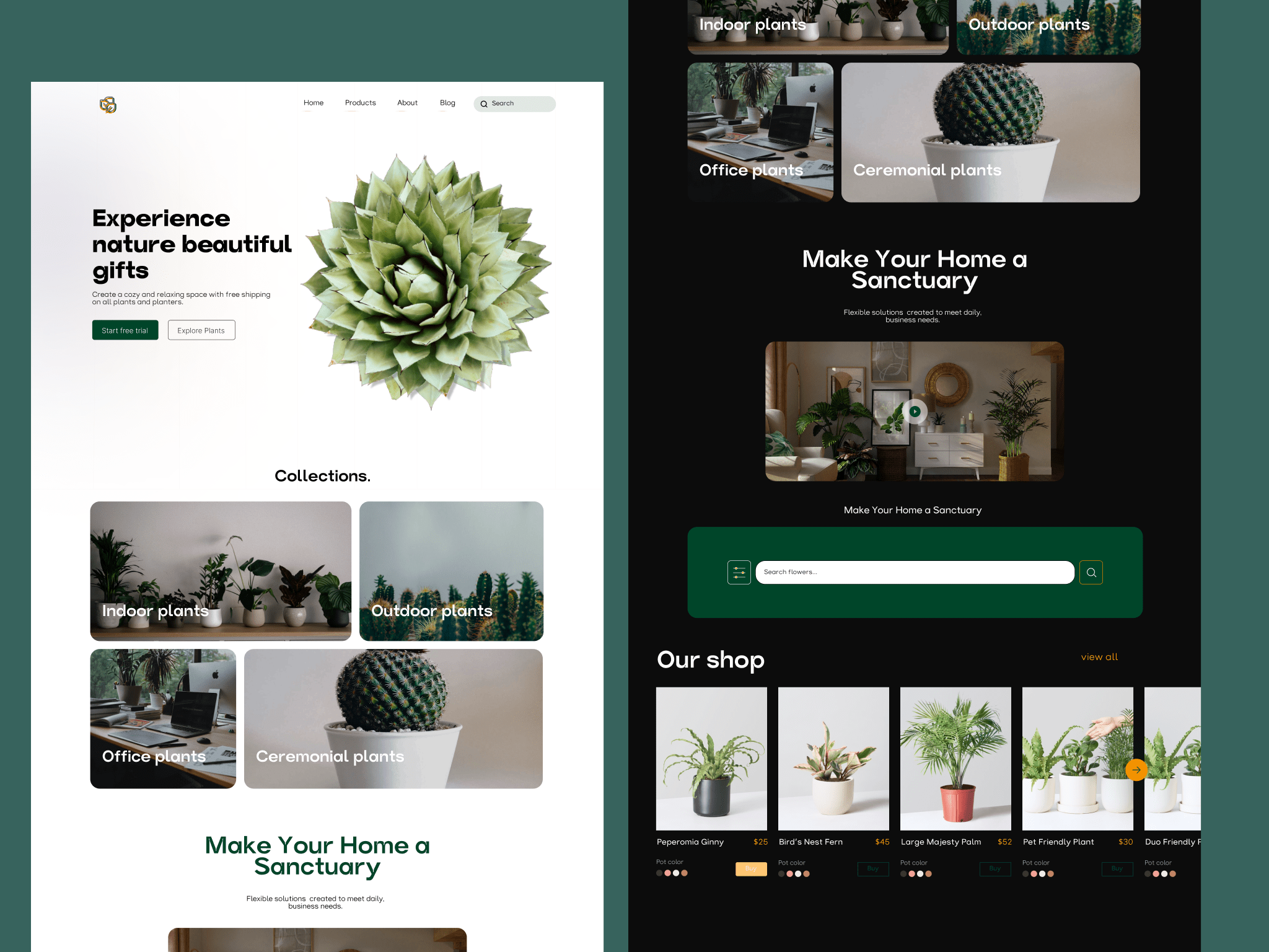
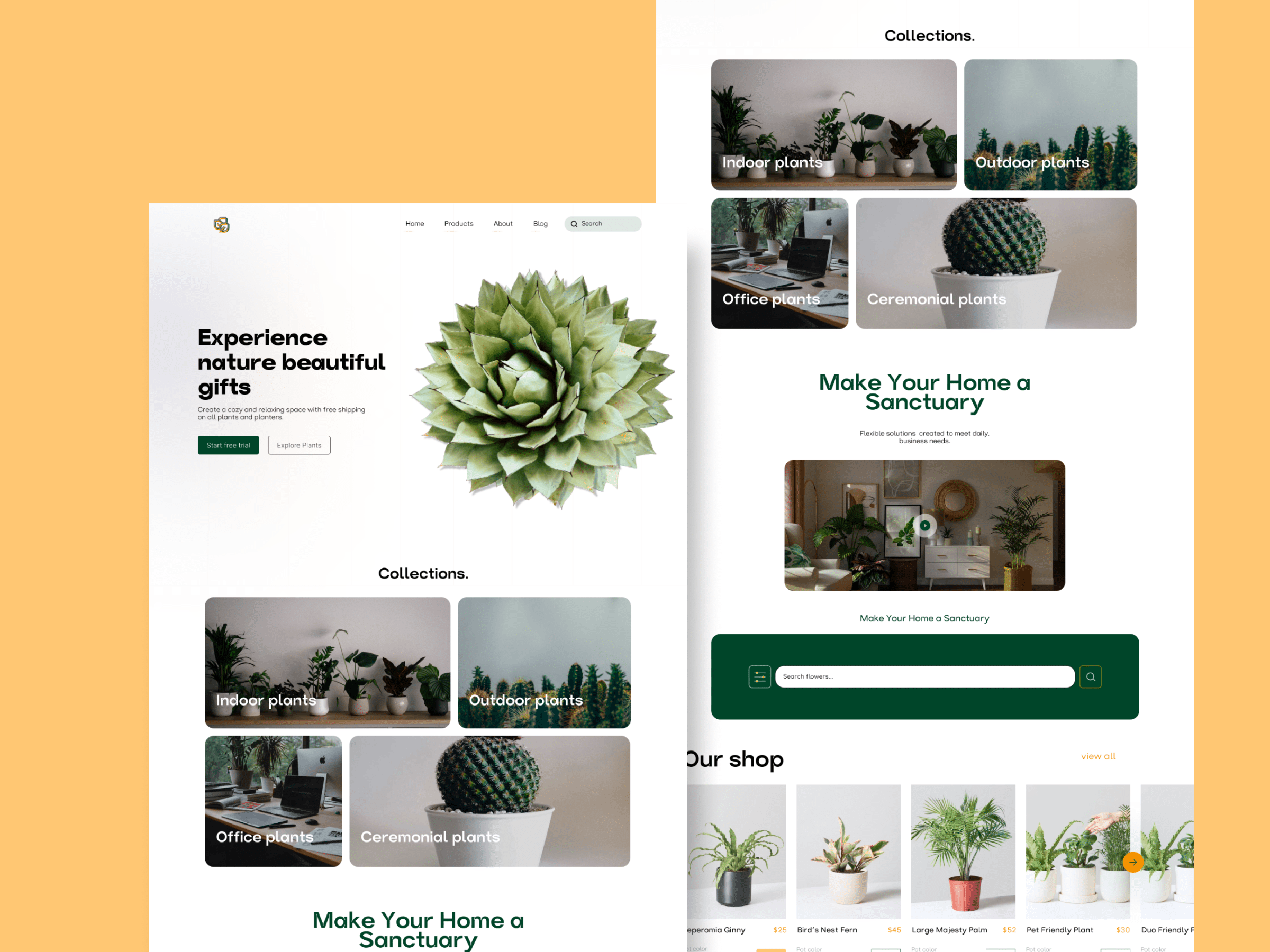
Hifidelity Designs
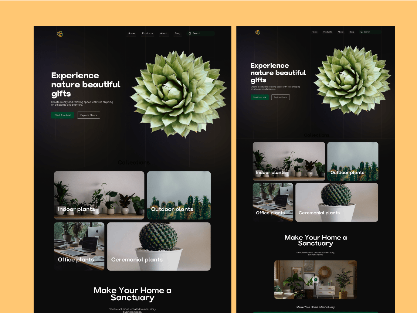
With the user stories developed and a better understanding of the live streaming framework the engineering team used, the design team was tasked in 4 weeks to establish an experience that would be design against the user stories created for the product.

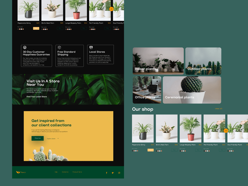

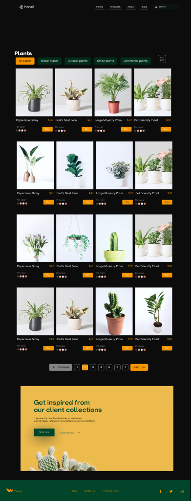
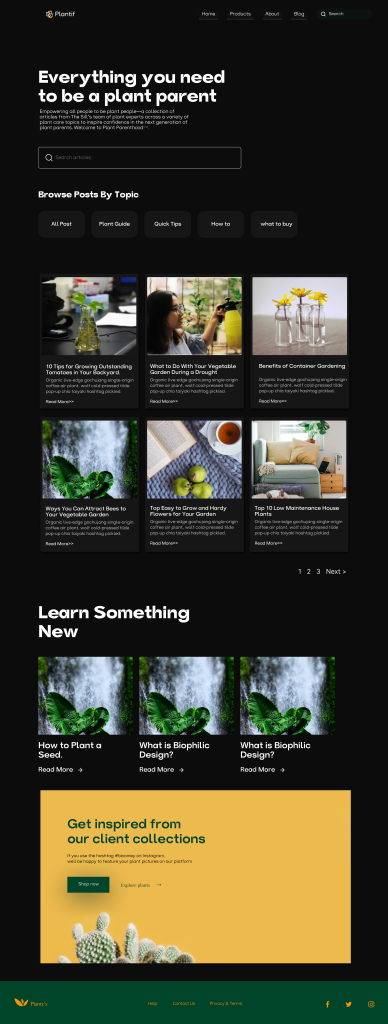
With the user stories developed and a better understanding of the live streaming framework the engineering team used, the design team was tasked in 4 weeks to establish an experience that would be design against the user stories created for the product.
Responsive Mobile screens
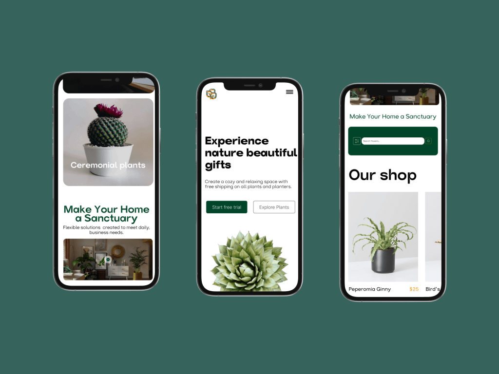
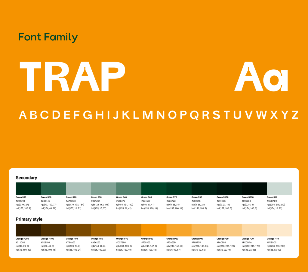
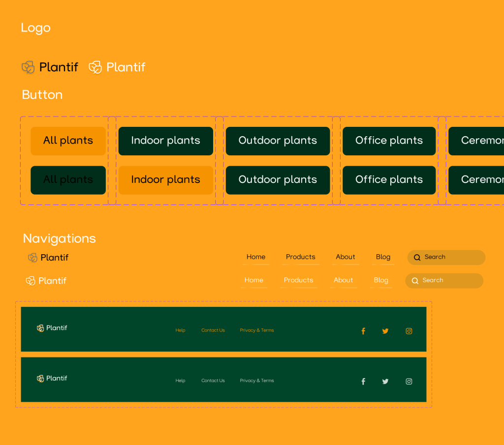
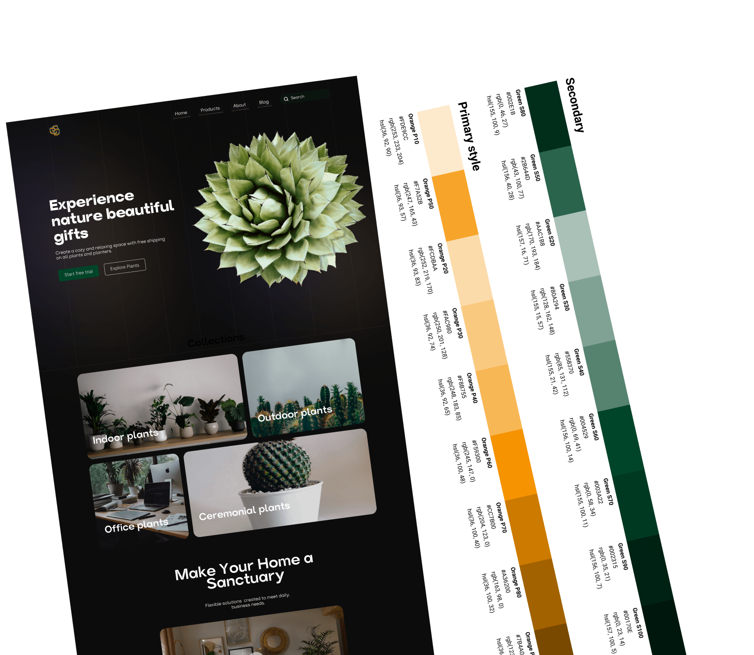
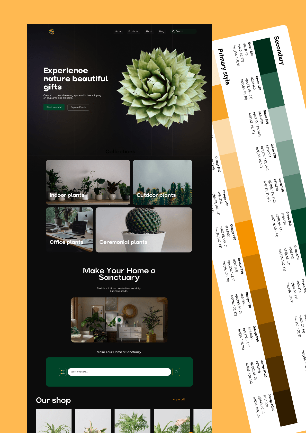
DESIGN SYSTEM
