Case Study: Droma Fintech app
Overview
Mobile app for day to day transaction and management.
Roles
- Lead designer
- Interaction designer
- Visual designer
- Prototype
- Project manager
- Design system
Introduction
Although financial services have made amazing progress as a result of technological advancements, there are still unneeded expenditures and difficulties that can occasionally be quite important for small businesses. My design research for Droma tells the tale of the fintech service promising to address this issue and reduce the complexity of financial transactions without imposing a charge. Tracking your spending can be a difficult process, but with the Droma app you become more conscious of your spending.
The management of finances and accounts has been a real problem for a while, but in recent decades, with the introduction of contemporary technology and the internet, which is becoming more and more accessible, it has taken on a new viewpoint. For designers and developers of digital tools that will assist people in tracking and managing their money flows, whether professionally or just for themselves, it poses a new problem.
Problems
Regular finance apps make it difficult to track finances and are not so friendly when it comes to documenting the flow of income in and out of your account. Most people are not financially literate and they have an habit for excessive spending
Solutions
Maintaining a balanced budget will help you keep on track and relieve some of the stress associated with your long-term financial stability.
The Goal
To make sure that Customers can track and keep record of their expenses and make payments within seconds.
Design Process or Thinking Process
Understand
Understand the problem and gather up requirement
UX research
Scenario, User journey map,user stories
Design
Information architecture,sketch flows, visual designs, prototype
Validate
Iterate
User Personas
In order to illustrate the key audience of my product, and to help potential stakeholders gain more sympathy for the target issues, I created this persona so we can understand what a typ


Wireframing, UI, and Prototype
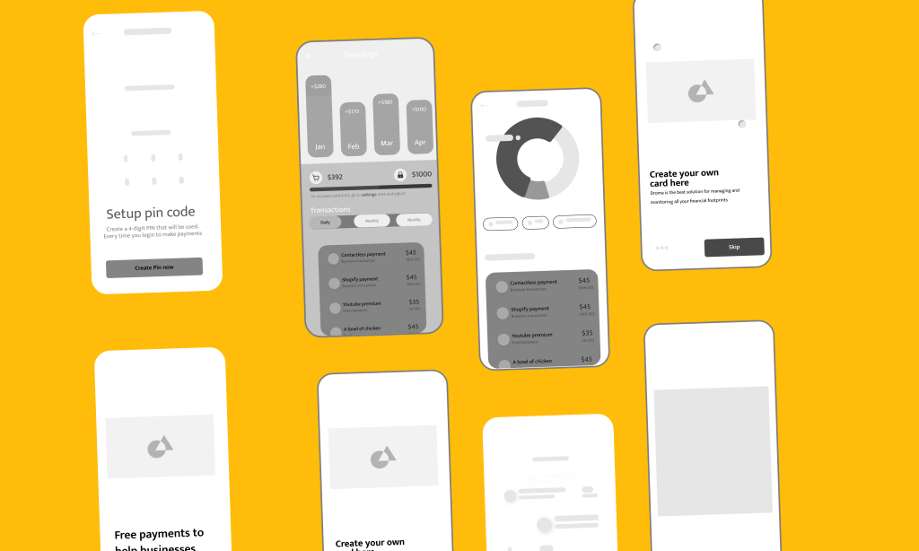
Wireframes
With the user stories developed and a better understanding of the live streaming framework the engineering team used, the design team was tasked in 4 weeks to establish an experience that would be design against the user stories created for the product.
Hifidelity Designs
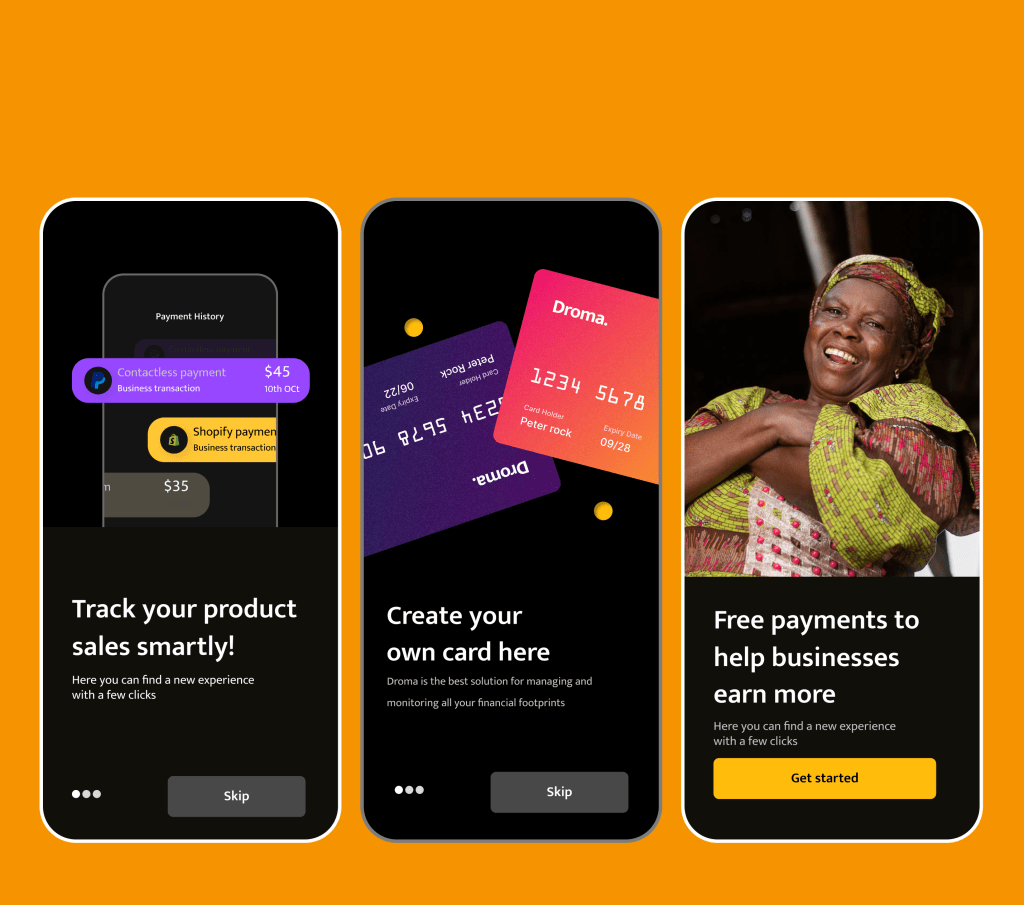
With the user stories developed and a better understanding of the live streaming framework the engineering team used, the design team was tasked in 4 weeks to establish an experience that would be design against the user stories created for the product.
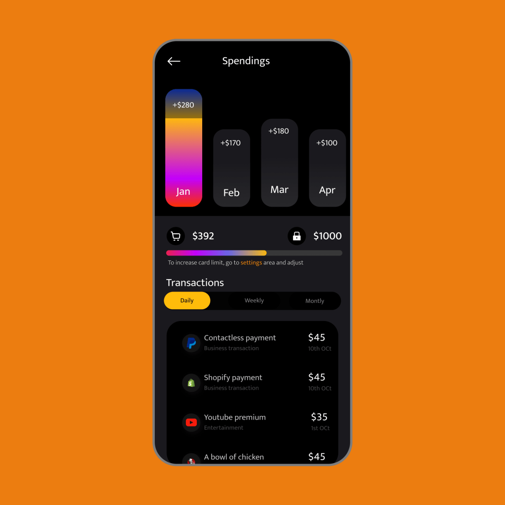
Ability to track payments
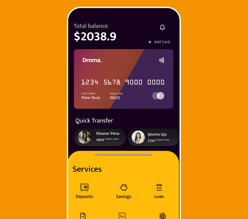
To track expenses users can switch between each months and see the total amount spent in each of these months.
Also there’s a Tab bar lets users switch between daily, weekly and monthly expenses at a glance. To maximize financial prudence I added a card limit that users to curtail excess spending.
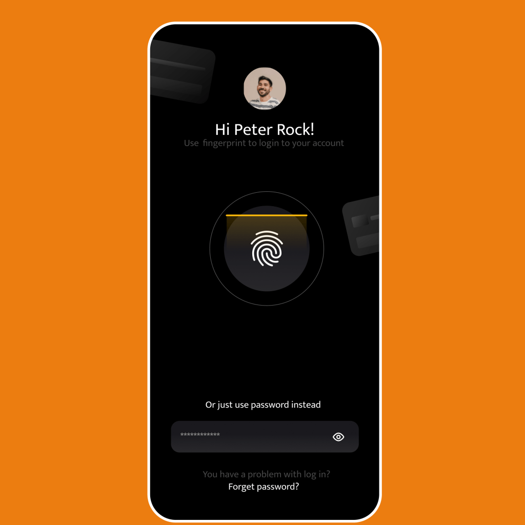
Card security
Fingerprint security can be setup to aid security for droma app. Prioritizing the safety and security of funds is an important feature for every security tool
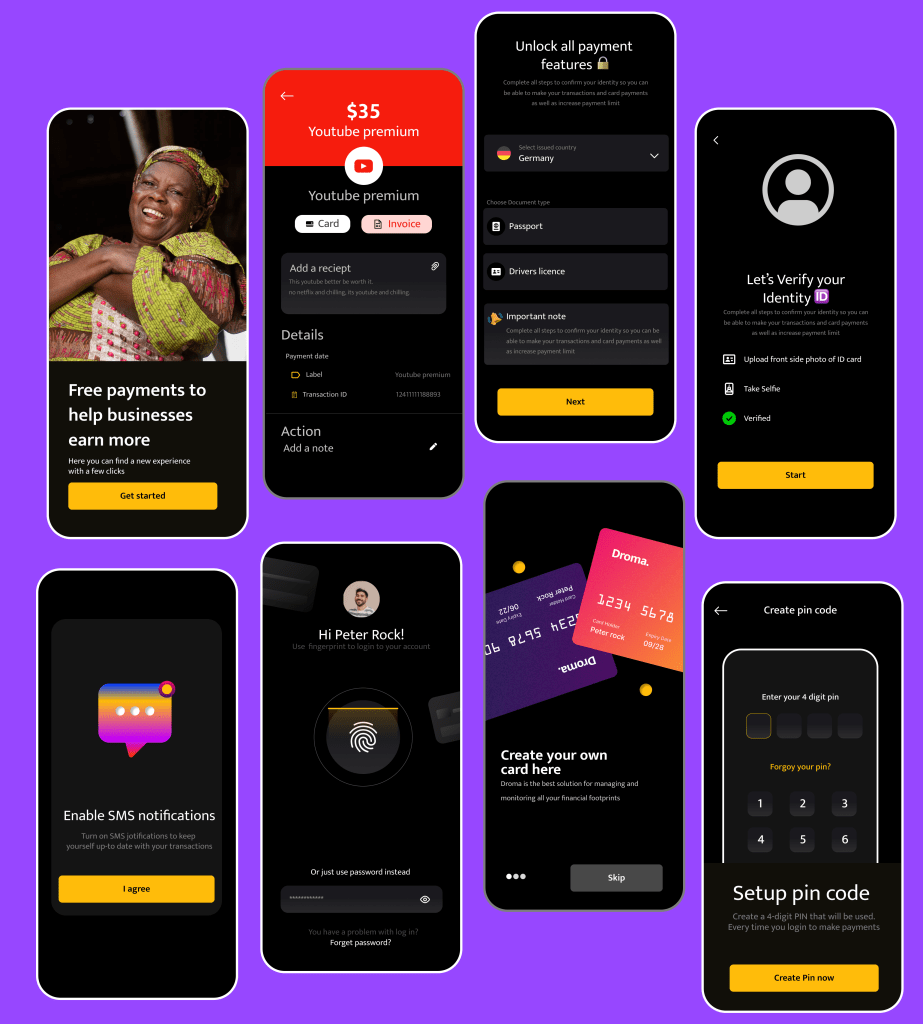
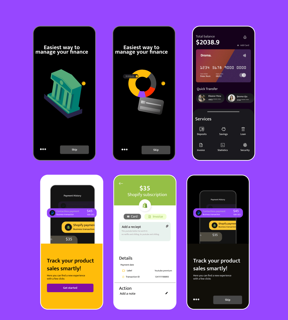
All the screens.

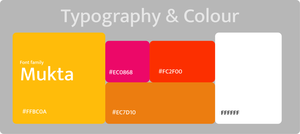
DESIGN SYSTEM
Website Design
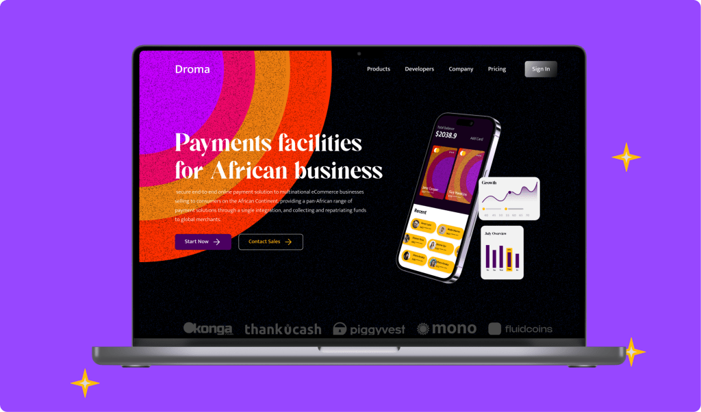
Making a landing page or website to convey the benefits and link consumers to the product in an effective, educational, and entertaining way is one of the tried-and-true methods of developing a strong mobile application brand and successful promotion..
The hero section presents the immediate visual connection to the technology via the prominent image demonstrating both the device and the app and giving the main idea about the product and its value for users via informative tagline and short description. The call-to-action button in the hero section is instantly visible due to the color contrast.
